We hope you enjoy reading this blog post
If you need help with website or marketing, book a call with our team for a free 360° overview and actionable recommendations report. Book a call

If you need help with website or marketing, book a call with our team for a free 360° overview and actionable recommendations report. Book a call

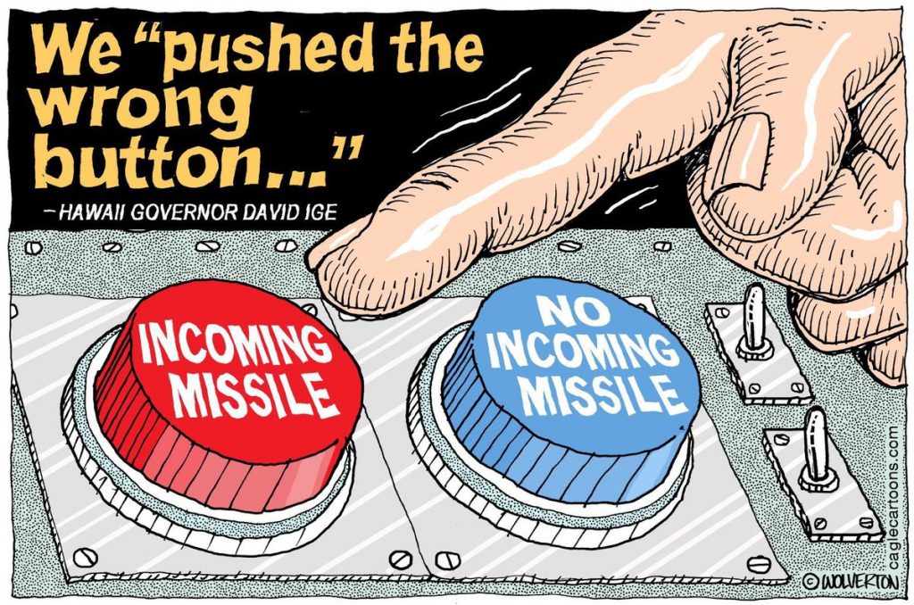
When we are living in an age of “my button is bigger than your button”, the results of pushing the big button or the wrong one can have dire consequences.
The Hawaiin Emergency Management Agency – also known as HEMA, inadvertently pushed the wrong button. There were options available on the HEMA computer system for missile alerts. One is labeled “test missile alert”, which will test the notification system is working without sent an actual alert to the general public. The other option was “missile alert” which sends an alert to every mobile phone in the state of Hawaii. The difference between the two options was one word = test and it was easily overlooked. Not only that but the confirmation prompt was also selected by the HEMA employee.
So on January 13, 2018, at 8:08, residents of Hawaii were notified of an incoming missile threat. “This is not a drill” the message read. Recipients of the message had about 15 minutes to find shelter and then say goodbye to their family and friends.
This was my phone when I woke up just now. I’m in Honolulu, #Hawaii and my family is on the North Shore. They were hiding in the garage. My mom and sister were crying. It was a false alarm, but betting a lot of people are shaken. @KPRC2 pic.twitter.com/m6EKxH3QqQ
— Sara Donchey (@KPRC2Sara) January 13, 2018
Some Hawaiians were sharing their experience of receiving the alert on social media.
“This was my phone when I woke up just now. I’m in Honolulu, Hawaii and my family is on the North Shore. They were hiding in the garage. My mom and sister were crying. It was a false alarm, but betting a lot of people are shaken,” Sara Donchey, who is identified on her Twitter biography as a reporter for a local television in Houston, Texas, wrote on Twitter, accompanied by screenshots of text with her family.
The cause of this panic was human error. This could have been easily avoided. This was a catastrophic failure of the UI. Let’s examine the screenshot below. The new “BMD False Alarm” option has been added only since the initial attack warning was sent out on Saturday. The red box (PACOM (CDW) – STATE ONLY, and located just under the words “TEST Message”) is the setting that triggered panic on Saturday. The green box (DRILL – PACOM (CDW) – STATE ONLY) is the option that should have been used to test the system without causing a statewide panic.
![]()
Looking at such a poor UX design, or its absence illustrates poor error prevention. The design looks like something out of Craiglist. Error prevention is one of Jakob Nielsen’s 10 heuristics for user interface design, and it becomes especially important for critical systems like emergency-alert systems or hospital systems where pushing the wrong button could be the difference between life and death.
We all can relate to pushing the wrong button or selecting a wrong option from the drop-down menu by accident. This happens, but thankfully, none of these mistakes send a whole state into a panic, but they’re examples of slips.
We make them when we’re tired, on autopilot or mentally ready to move on to the next task. However, this can also happen when options look very similar, lack visual styling differentiation or have similar names. In this case, PACOM (CDW) and DRILL – PACOM (CDW) are very similar. Options on the screen are mixed, why not separate them into appropriate groups? Or better yet, create very distinctive groups that separate PACOM, BMD, and CEM.
A simple Google search for UX dashboard design returns hundreds of examples where clear messaging, color differentiation and iconography help user better understand the options available.
Another failure in application design is the ability to undo or reverse the erroneous action. The message sending can’t be stopped or undone. Just think about it, we can undo email send and have 3-4 seconds to do so (how many times this saved me) and can’t undo a message that can literally destroy lives.
Since the alert snafu, HEMA has made some adjustments to the computer system to prevent future mishaps. It has added a “cancellation button” which allows the user to send a second alert over the same system that notifies recipients that the first message was a false alarm. HEMA also added a requirement for a second person to confirm the message to be sent.
Mistakes will be made and we need to plan for them accordingly. A good user interface will make it hard for people to make errors and provide a way to recover or prevent them from happening. We discovered the design flaws.
Let’s hope that the next time a person will be assigned with a simple task that can affect millions of people, a good interface design will help them prevent errors and panic. Rest assured that this will be an example of how bad user design can truly create chaos. Let’s hope others will learn from this mistake and that it will not be repeated anytime soon. Good design does matter.
“Bad design is not just ugly…it is dangerous.” M. Cobanli
Please complete the form below and one of our team members will be in touch shortly.