We hope you enjoy reading this blog post
If you need help with website or marketing, book a call with our team for a free 360° overview and actionable recommendations report. Book a call

If you need help with website or marketing, book a call with our team for a free 360° overview and actionable recommendations report. Book a call
People make snap decisions online. If your homepage doesn’t meet their needs or catch their interest right away, they will leave quickly. Did you know your homepage is vital in shaping perceptions, building trust, and driving action? Social media is often the first place people connect with you. However, to learn more about your business, they visit your homepage. But what if no one is staying long enough to learn about what you do?
A well-designed homepage can be your best asset. It attracts visitors, guides them to what they need, and encourages them to connect more with your brand. Making the right design choices can reduce bounce rate, increase conversion rate, and increase traffic to your website.
In this post, we will guide you through the key parts of an effective homepage. This homepage will help you attract, engage, and convert your visitors clearly and confidently.
Here’s what we’ll cover:
By the end, you will have a clear plan to check your current homepage. You can also create one from scratch. This will help make a great first impression and keep people coming back.
A recent study showed that websites drive more traffic than any other means. Before diving into design or content specifics, it’s important to understand what your homepage is meant to do. Your homepage is the digital front door to your brand. Like a good welcome mat, it should invite, inform, and guide clearly.
Visitors typically decide within seconds whether to stay or go. In that short time, your homepage must show who you are, what you offer, and why it matters. It should also feel easy to use and navigate. A cluttered, confusing, or overly vague homepage will drive people away. A clean, intentional one makes them want to explore more.
A homepage should never be everything to everyone. Instead, define what you want it to accomplish. Is your goal to:
Once you have clear primary and secondary goals, you can structure your homepage to support them. Use messaging, visuals, and user pathways that are easy to understand.
Your homepage should look and sound like your brand. That means colors, fonts, layout, and copy should all reflect your personality. Whether that’s bold and modern, calm and minimalist, or warm and approachable. Just as importantly, your homepage should serve your business objectives. Every part, from the headline to the footer, should help move your audience from interest to interaction.
You know that feeling when you walk into a space, and it just feels right? Maybe it’s the lighting, the way the furniture is arranged, or just the energy. That’s exactly what a hero image does for your website. It’s the visual “hello” that welcomes visitors when they arrive on your homepage. It sets the tone for everything that comes next.
At its core, a hero image is that big, bold visual you see at the top of a website. It usually stretches full width and is often paired with a few words and a call-to-action button. But it is not just a banner, this is your brand’s first impression. The first thing people see is important. With technology today, attention spans are very short. Your hero section must grab attention quickly. When done right, it can stop someone in their tracks. Done poorly, and people might click away before they even figure out what you do.
Think of your hero image as your website’s elevator pitch, but visual. Within a few seconds, it should tell your visitor:
This might sound like a job for one section, right? But this is doable if you approach it with intention. A compelling hero image can create an emotional connection instantly. It all depends on your brand’s story and how you visually bring that story to life.
Firstly, quality matters. If your image is grainy, awkwardly cropped, or stock, people notice. You must invest in high-resolution photography or even short-form video. Some of the best hero sections today have subtle motion. This can include a slow pan across a landscape or a product gently rotating. Soft text animations can also add life without being distracting.
Keep the text simple. Your overlay should be short, punchy, and emotionally clear. This is not the place for a paragraph. A strong headline and maybe a subhead will do the trick. Think more “Bold Digital Experiences Start Here” and less “Welcome to Our Website, We’re So Glad You’re Here.”
Never overstuff your hero image. One powerful image, a strong message, and a clear button (like “Shop Now” or “Join the Movement”) is often all you need. Clean, uncluttered layouts let your content breathe and guide the eye where you want it to go.
The truth is, no one is reading every word on your homepage. They’re skimming, scanning, and deciding whether they’ve landed in the right place. That’s why your headline needs to hit hard and fast.
It should speak directly to your audience’s pain point or goal. Not in a vague way but in a way that makes them say, “Yes, that’s exactly what I need.” For example, instead of “Innovative Solutions for Modern Businesses,” try something like “We Help Startups Scale Without the Guesswork.” Be clear, specific, and benefit driven. Your sub headline should then offer a little extra context or reinforce the value. Think of it as your chance to say, “Here’s how we help.”
Keep the tone simple, warm, and human. You don’t need buzzwords to sound smart. You need clarity to sound trustworthy. Write like you’re talking to someone who doesn’t know your industry but needs your help.
Now that you’ve caught their attention with the visuals and messaging, what’s next? This is where a strong CTA comes in. A good call-to-action is crystal clear and easy to spot. It uses action verbs like “Start Free Trial,” “Book a Demo,” and “See It in Action.” These phrases often stand out with bright colors and strong contrast, making them hard to miss.
Most websites benefit from having their primary CTA above the fold, meaning visitors see it without having to scroll. But don’t stop there. As users move through the page and learn more, place supporting CTAs at natural decision points. That way, whenever someone’s ready to act, the next step is right there.
Tools like heatmaps and A/B testing can show you where people click and where they leave. This helps you adjust your CTA placement and wording for the best results.
Now that your hero image and headline have piqued interest, how do you convince them to take the next step? This is where trust signals come into play. Logos of well-known clients or partners can go a long way. Even if you’re a smaller business, displaying recognizable names (or even local institutions) creates instant credibility. Short, punchy testimonials help, too. A line or two from a real client saying how you helped them. You can also include trust badges like certifications, awards, or affiliations. Make it easy to find deeper proof points like your About page, case studies, or client success stories. Some people need a little more before they’re ready to click that CTA.
None of this works if your site is frustrating to use. Your homepage needs to look just as good and function just as smoothly on a phone as it does on a laptop. In other words: mobile-first, always. Your navigation should be clean and intuitive. No hunting for the menu, no ten-layer dropdowns. Keep it simple: Who you are, what you offer, and how to contact you.
As users scroll, the content should flow naturally. Avoid walls of text. Mix in visuals. Break things up with headers. And make sure everything is accessible, which includes proper color contrast, readable font sizes, and alt text for images. A homepage that excludes people (even unintentionally) is a homepage that loses leads.
Even the prettiest site can turn people off fast if it does too much or too little. Here’s a quick list of homepage don’ts:
At the end of the day, your homepage isn’t just a billboard, it’s a roadmap. It should welcome visitors, help them feel seen, and guide them toward action.
So here’s your challenge: Take a fresh look at your homepage. Go through the points we covered:
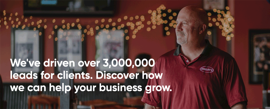
If you’re unsure, we’ve got you. Reach out to our team here at WDB Agency for a free homepage audit. Either way, let’s make sure your first impression is a powerful one. Schedule your call with us now.
Please complete the form below and one of our team members will be in touch shortly.