We hope you enjoy reading this blog post
If you need help with website or marketing, book a call with our team for a free 360° overview and actionable recommendations report. Book a call

If you need help with website or marketing, book a call with our team for a free 360° overview and actionable recommendations report. Book a call
Every website has a primary focus, and that is clearly outlined in the strategy. A nonprofit site focuses on community impact. An e-commerce site is built to sell products and services. Now, with a software as a service (SaaS) website, this is a digital storefront for software with one major goal in mind: conversion through sign-ups, demos, or trials.
Bear in mind that your website is the first impression that a visitor gets of your product, and first impressions are everything. If the design is confusing, slow, or outdated, visitors will not just bounce, they churn. And churn kills growth.
Great SaaS websites are not just attractive; they are built with strategy. Web design plays a direct role in whether someone signs up, stays around or moves on to another page. This is why getting it right is so important.
Let’s break down the three core pillars of effective SaaS web design:
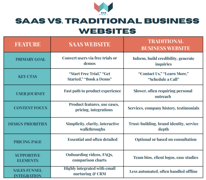
Let’s start with the difference between a traditional website and your Saas Website.
It is important to recognize how the goals, structure and user experience differ from traditional business sites. Here is a quick table that describes those differences:
| Feature | SaaS Website | Traditional Business Website |
| Primary Goal | Convert users via free trials or demos | Inform, build credibility, generate inquiries |
| Key CTAs | “Start Free Trial,” “Get Started,” “Book a Demo” | “Contact Us,” “Learn More,” “Schedule a Call” |
| User Journey | Fast path to product experience | Slower, often requiring personal outreach |
| Content Focus | Product features, use cases, pricing, integrations | Services, company history, testimonials |
| Design Priorities | Simplicity, clarity, interactive walkthroughs | Trust-building, brand identity, service depth |
| Pricing Page | Essential and often detailed | Optional or based on consultation |
| Supportive Elements | Onboarding videos, FAQs, comparison charts | Team bios, client logos, case studies |
| Sales Funnel Integration | Highly integrated with email nurturing & CRM | Less automated, often handled offline |
While SaaS websites are all about letting users experience the product quickly and confidently. Traditional business sites are usually more about relationship-building. They rely on informative content, trust signals, and consultation forms to generate leads for a longer sales cycle. For SaaS websites, there are fewer clicks to conversion, simplified navigation, and clear value propositions. Every page, from the homepage to the pricing section, is built to answer the user’s big question: “How will this help me solve my problem?”
A streamlined Saas website emphasizes clarity, visual hierarchy, enough white space and an intuitive navigation, making it easy for users to understand what you are offering and what to do next. Remember, clean, uncluttered design is not just aesthetics, it drives action.
What are the specific Saas Needs?
The target users are typically busy and goal driven. When they land on your site, they have one question, “what value does this offer me?” This means that your design should highlight core features, key benefits and pricing, clearly and quickly without distractions.
Here is how you do that.
For every second your SaaS site takes to load but lags, it chips away at your visitors’ patience and eventually your conversion rate. Studies show that increasing page load speeds could potentially double the bounce rate even for a 2 second delay.
Let’s go through some pathways to create less friction, starting with speed.
Speed Optimization Tips
Let’s move on to some user experience.
Keep the onboarding flow simple: Start with streamlining sign-ups and first use walkthroughs. By using clear, progressive steps instead of dumping all the options at once.
Button Placement and Micro-interactions: Place primary CTAs “above the fold” and leverage subtle hover or click animations to reassure users their actions are registered without delaying the page rendering.
Mobile Responsiveness: Freemium or trial users often explore on mobile first. Ensure that layouts adapt seamlessly. The text remains legible; touch targets stay large and essential features load without blocking. Pro Insight: UX Writing as Design
The copy is also a vital feature as much as the visuals. Microcopy, such as labels on buttons, error messages, and tooltip text, should be concise, action-oriented and consistent. Use clear and empathetic language to reduce friction and help users know exactly what to expect at each step, reinforcing the fast, frictionless experience.
What “Scalable” Means in SaaS Design
This is not just about handling more users or data, it is about building a design system that can evolve without constant rebuilds. Your design should be able to support new features but using frameworks and layouts without stomping on your existing styles or flows. In addition, seamless integration with CMS is helpful for marketing teams that thrive on autonomy. They should be able to implement tests without having to bug developers while the product scales both technically and organizationally. A true scalable architecture should leverage design tokens and component libraries. These components let you update a button’s look or behavior in one place and push changes everywhere.
Here is a journey map to help guide you through:
Start with Real-World Data in Mind
Use realistic examples for forms, charts and dashboards, not just placeholders. This helps developers form a clear picture of how the product should function and helps avoid confusion when it is time to build.
Map The Full User Journey
Think through your entire sign-up process, from Login to password reset. It is important to plant what different users will see after they log in. With these clear paths, you create a smoother, more secure user experience.
Design for Flexibility
If your platform serves multiple clients or user types, design for that from the start. Use subtle branding cues (like colors and logos) to help users know where they are, and outline what each type of user should be able to access. This makes your platform easier to scale as you grow.
By using tools like Figma to create organized and clearly labeled design files so that you can identify what each element is, how it should behave and how to build it. Build a shared set of buttons, forms, and layout blocks that can be reused across your product. This kind of design system ensures consistency, speeds up development, and cuts down on rework. In addition, pre-built design frameworks like Tailwind UI and content platforms with headless CMSs make it easier for teams to work faster. Marketers can update content without touching code and developers can focus on functionality.
Your SaaS website is far more than a static brochure; it is an extension of your product and brand. By prioritizing clean layouts, you draw users in; by optimizing speed and user experience, you keep them engaged and by building for scalability, you ensure your site evolves alongside your app.
At WDB agency, we specialize in crafting web experiences that are dynamic and forward-thinking. From modular design systems to API-driven workflows, to performance tuning and inclusive, international-ready interfaces, our team has the expertise to elevate every aspect of your site.
Are you ready to update your Saas web design? Let’s build something that scales with you. Reach out to us and let’s turn your vision into a high-impact, growth-ready reality. Schedule your call today!
Download the quick comparison table, saas vs traditional business website.
Please complete the form below and one of our team members will be in touch shortly.